


Tutorial Resources
- PSD: Colorful Glowing Orbs by Richard Carpenter (GraphicRiver)
- Icons: Practika: A Free Icon Set by DryIcons (Smashing Magazine)
- Icons: WooFunction by Liam McKay (WooThemes)
- Stock Graphic: iPad by Kevin (deviantArt)
Step 1: Set Up the Canvas
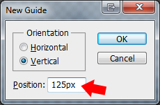
Create a new 1200×1165px document (Ctrl/Cmd + N) with Background Contents set to Transparent.The web layout we’re going to be making will have a width of 950px, so to ensure our layout contents stay inside this width, let us set up two Photoshop guides. To do this, go to View > New Guide; in the dialog window that pops up, choose Vertical for Orientation and enter 125px for Position.
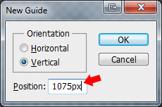
Use the same process to add a vertical guide at 1075px.
You should have something that looks like this:

Step 2: Create the Layout’s Background
In the Tools Panel, change your Background Color to black (#000000) and your Foreground Color to a very dark gray (#0e0e0e), then select the Gradient Tool (G) and make sure to choose Linear Gradient in the Options Bar.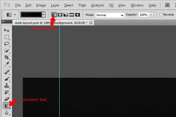
Create the linear gradient from the top of your canvas and downwards towards the bottom.
Add a subtle texture to the background using the Noise filter (Filter > Noise > Add Noise) with Amount set to 1%, Distribution set to Uniform, and the Monochromatic option checked.

Step 3: Create the Layout’s Header
Choose the Rounded Rectangle Tool (U) from the Tools Panel and set its Radius to 10px.
Drag out the rectangle in between your two guides; the rectangle should be exactly 950px wide and 120px tall.

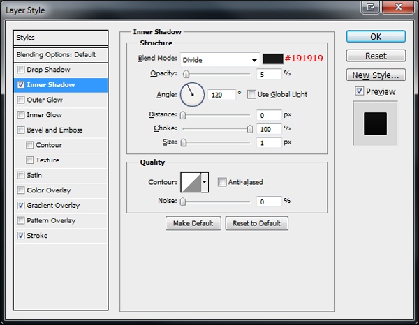
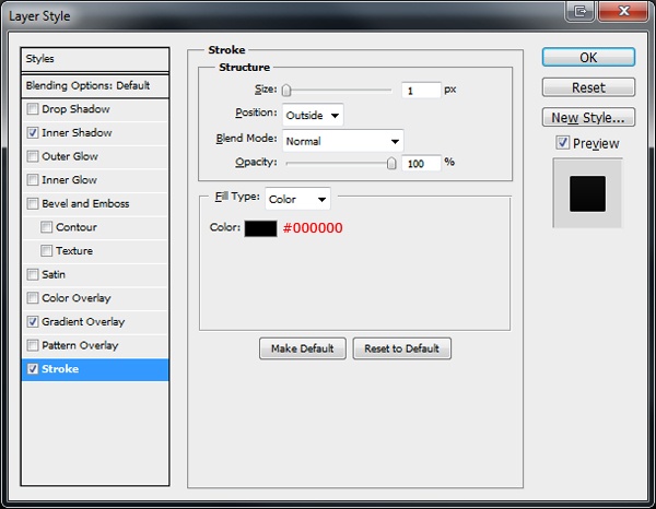
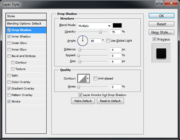
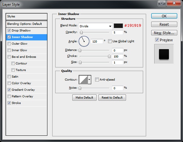
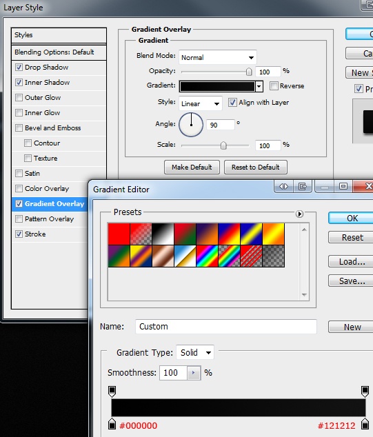
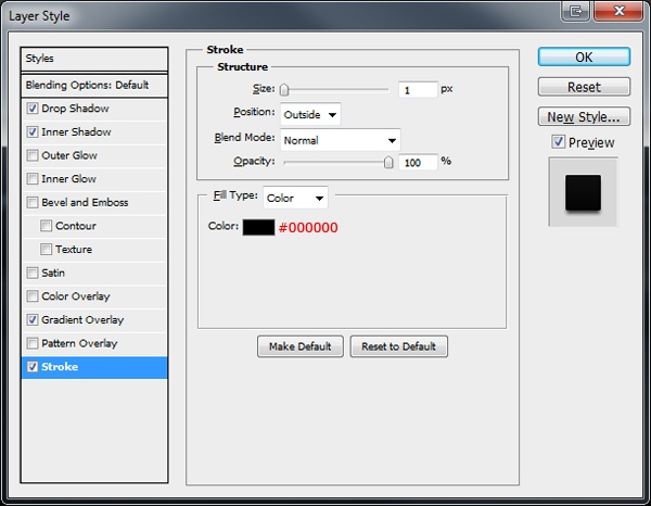
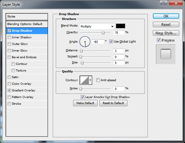
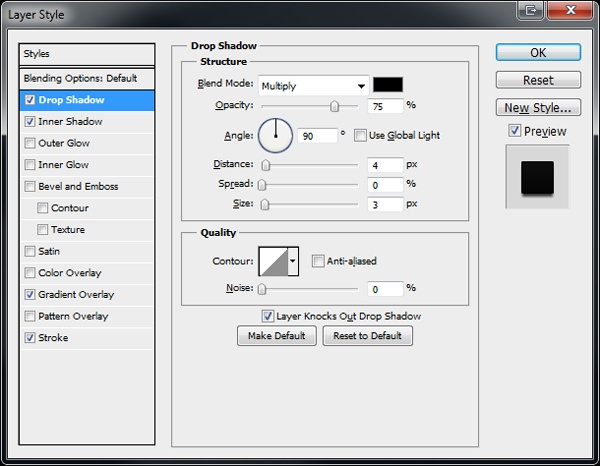
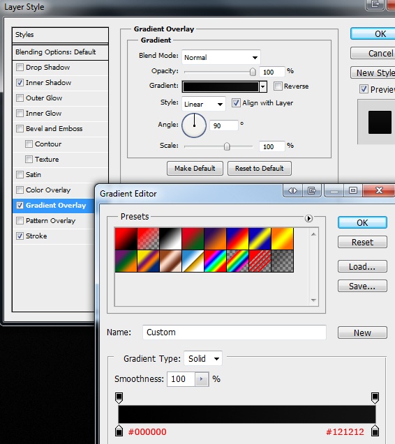
Once you’ve created the rectangle, double-click on its layer to open up the Layer Style window and give it a Drop Shadow, Inner Shadow, Gradient Overlay and Stroke.
Drop Shadow

Inner Shadow
Gradient Overlay

Stroke
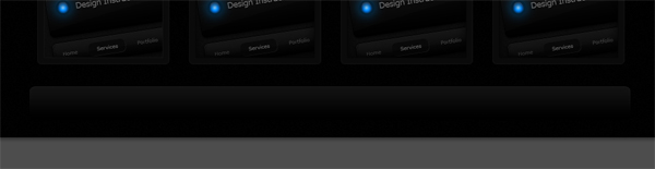
Here is the outcome of the layer style we applied to the header layer:

We’re now going to create a shine effect on the header. Go ahead and choose the Pen Tool (P), then draw a path on top of the header–the look you’re going for is to have a nice curved edge at the bottom.
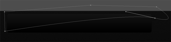
Fill your path with white (#ffffff). Next, we need to remove the excess white areas that spill outside of the header. First, click on the white shine layer in the Layers Panel to make it the active layer. Then Ctrl/Cmd + click the thumbnail of the header layer to load a selection around it. Invert the selection by going to Select > Inverse (Shift + Ctrl/Cmd + I). Make sure that the active layer is still the white shine layer, then hit Delete to remove the selected area.
You should be left with something like this:

Now set the Opacity of the shine layer to 1%, and then add a layer mask to the layer. Once you’ve added a layer mask, drag a linear gradient from the right side of the canvas to about a quarter of the way across.

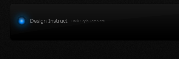
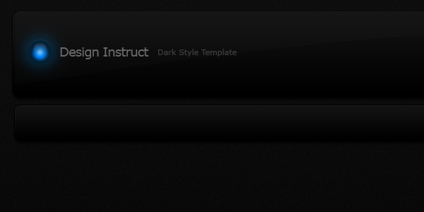
Step 4: Adding Header Content
Choose the Horizontal Type Tool (T) and then add your site’s title and slogan on the left side of the header. I went with "Design Instruct" as the site title, and "Dark Style Template" as the slogan.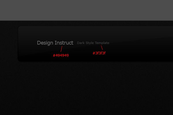
On the left side of the site title, add one of the glowing orbs from this resource (or create one of your own): Colorful Glowing Orbs.
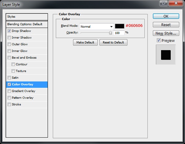
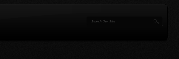
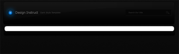
Next, on the right side of the header, we’re going to create our search field. Use the Rounded Rectangle Tool (U) with a Radius of 10px to draw a rounded rectangle onto your header.

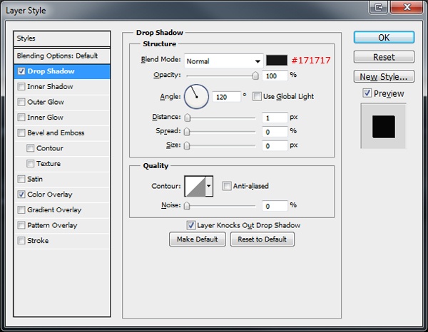
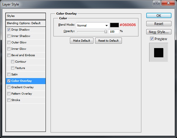
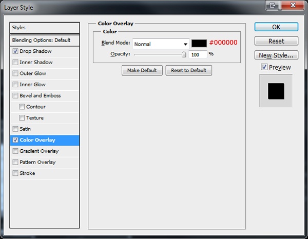
Double-click on the search field layer to open up the Layer Style window, then give it a Drop Shadow and a Color Overlay.
Drop Shadow
Color Overlay
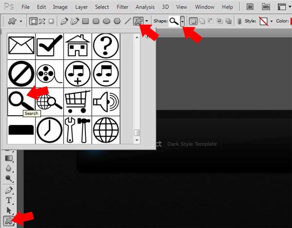
Inside the search field rectangle, add some placeholder text (such "Search our site"). On the right side of the search field, add a small magnifying glass from Adobe’s custom shapes library using the Custom Shapes Tool (U).
You should have something like this:
Step 5: Creating the Navigation Bar
Use the Rounded Rectangle Tool (U) with a Radius of 10px to create a rounded rectangle below the header; it should be 950px wide and 50px tall.
Double-click on the navigation bar’s layer in the Layers Panel to access the Layer Style window and give the layer a Drop Shadow, Inner Shadow, Gradient Overlay, and Stroke.
Drop Shadow
Inner Shadow
Gradient Overlay
Stroke
You should have something like this:
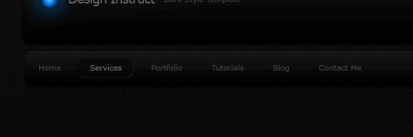
Use the Rounded Rectangle Tool (U) again to create another rectangle over the top of your navigation bar. Make this new rectangle half the height of the navigation bar (25px), but roughly the same width.
Set the opacity of the rounded rectangle layer to 1%. Select the Horizontal Type Tool (T) to add some navigation menu items such as "Home", "Services", "Portfolio", and so forth.
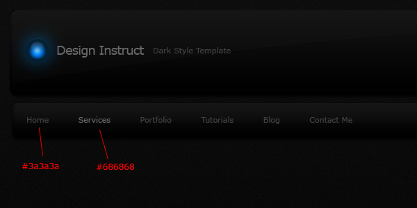
Let’s create a rounded rectangle behind one of the links to represent the currently active navigation item, using the Rounded Rectangle Tool.
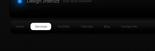
Give the active navigation item rounded rectangle a Drop Shadow and Color Overlay.
Drop Shadow
Color Overlay
What results is sort of this depressed look for the active navigation item:
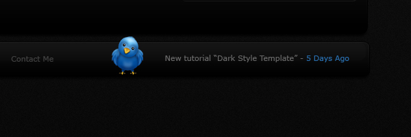
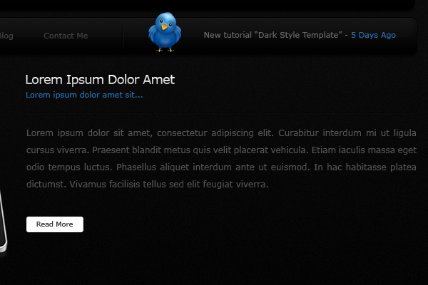
On the right side of the navigation area, add a little Twitter bird icon and some text that mocks up the most recent tweet of the site; I used the Twitter bird icon from the Practika icon set.
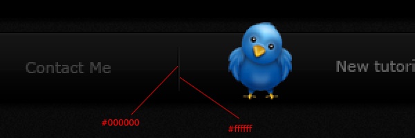
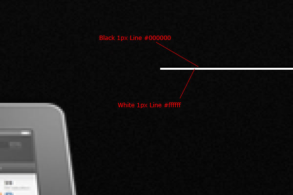
Finally, in between the Twitter icon and the last navigation item, create two vertical 1px lines next to each other. Fill the first line with black (#000000) and the second line with white (#ffffff), then set the layer’s Blend Mode to Overlay.
Step 6: Creating the Featured Area
Download the iPad pack, find the version of the iPad which looks like it’s lying flat, place it into our Photoshop document, use Free Transform (Ctrl/Cmd + T) to resize it, and then use the Move Tool (V) to position it underneath the navigation bar and towards the left of the canvas.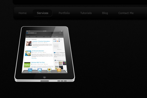
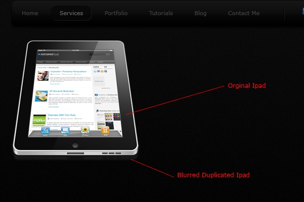
Duplicate the iPad layer and move the duplicate layer below the original layer in the Layers Panel. Run the duplicate layer through the Gaussian Blur filter (Filter > Blur > Gaussian Blur) with a Radius of about 2–3px. Afterwards, use the Move Tool (V) to shift the iPad down beneath the original.
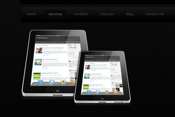
Add a second iPad using the same process, but make the second iPad smaller, place it to the right of the first (bigger) iPad, and make them slightly overlap.
Use the Rectangular Marquee Tool (M) to create two horizontal 1px lines on top of each other; fill the top line with black (#000000) then the bottom line with white (#ffffff). The line should start about 30px away from the iPad and stretch all the way to the right Photoshop guide that we created earlier. This is going to be our title divider.
Set the Blend Mode of the title divider layer to Overlay.

Above the horizontal line, add some text to represent a heading and a short paragraph of text.

Give the heading text layer a Drop Shadow and Gradient Overlay.
Drop Shadow
Gradient Overlay

Use the Horizontal Type Tool (T) to add a short paragraph underneath the title divider.

Let’s create a simple "Read More" button. Use the Rounded Rectangle Tool (U) to create a small button below the short paragraph.
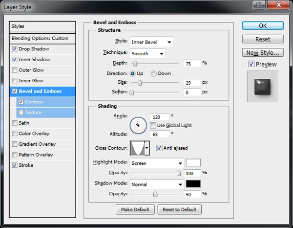
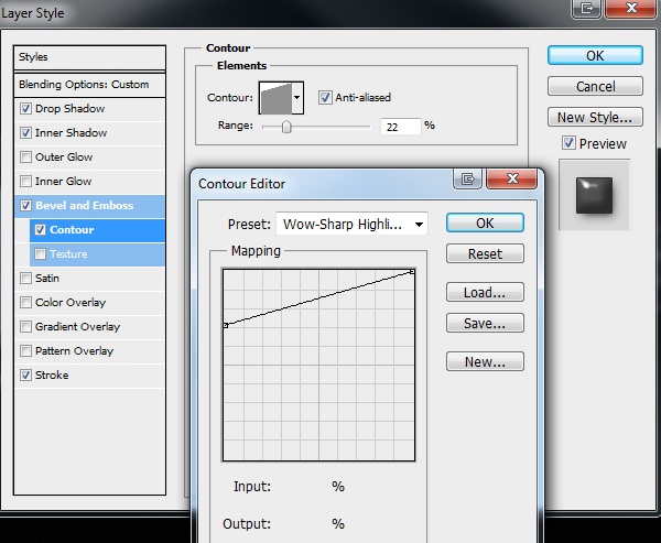
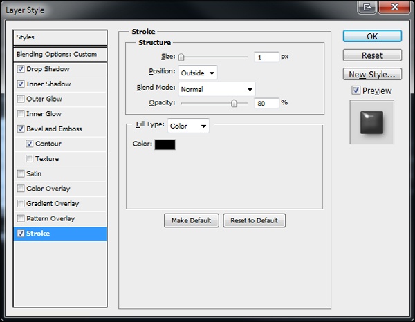
Give the "Read More" button a Drop Shadow, Inner Shadow, Bevel and Emboss – Contour, and Stroke.
Drop Shadow

Inner Shadow
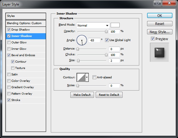
Bevel and Emboss – Contour
Stroke
Here is what we have so far:
Step 7: Creating a Slider Mock-Up
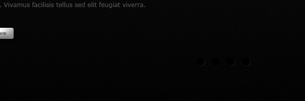
Our Featured area will be a slideshow, so we should create some user interface controls for it. Use the Elliptical Marquee Tool (M) to draw four circles, with each circle on a separate layer.Place the circles on the right side in the Featured area.
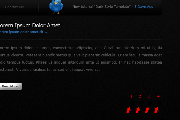
Give circles 1,3 and 4 a Drop Shadow and Color Overlay.
Drop Shadow

Color Overlay
You should now have something like this:
Give circle 2 a Drop Shadow, Inner Shadow, Outer Glow, and Gradient Overlay.
Drop Shadow
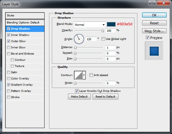
Inner Shadow

Outer Glow
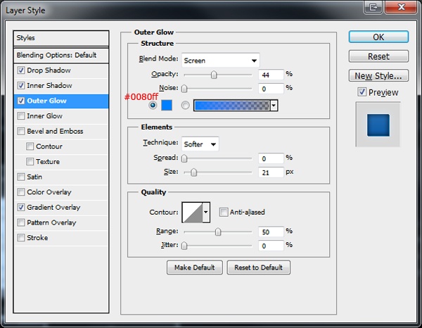
Gradient Overlay

This results in a glowing ball of light:

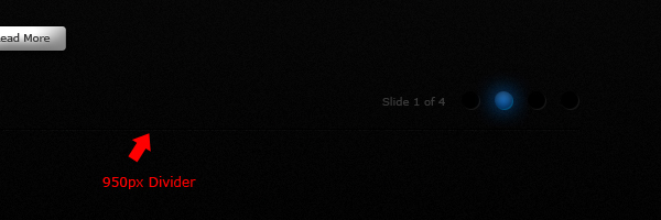
Use the Horizontal Type Tool (T) to add text on the left of the circles to indicate the current position (such as "Slide 1 of 4"). Create a 950px horizontal divider using the same method we used for creating the title divider.
Step 8: Creating the Services Area
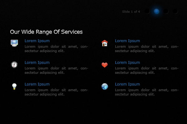
Using the Horizontal Type Tool (T), add two titles underneath the divider you created in Step 7 and use the same layer style we applied to the heading text layer (Drop Shadow and Gradient Overlay) in Step 6.
Under the left title, add a small paragraph of text, duplicate the "Read More" button we created earlier, and place it underneath the paragraph. On the right side, create a list of 6 items.
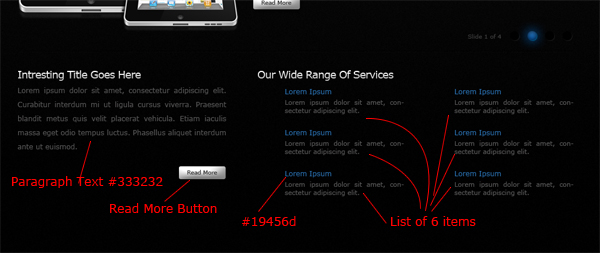
Give the list of items some icons that represent them visually. I used the WooFunction icon set to place 6 icons next to each of the list items.
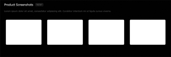
Step 9: Creating the Gallery
Underneath the Services area, create a new title heading the same way as before (with a Drop Shadow and Gradient Overlay). Next to the new title heading, create a small rounded rectangle using the Rounded Rectangle Tool (U). Inside the small rounded rectangle, add the text "New!" Underneath the title, add a short paragraph of text.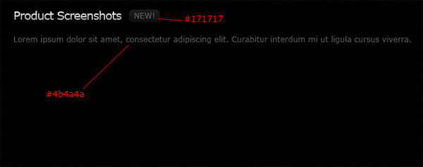
Select the Rounded Rectangle Tool (U), then create four rectangles that are evenly spaced apart; place each rectangle on a separate layer.
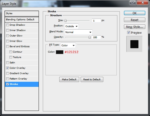
Give the rectangles a Color Overlay and Stroke.
Color Overlay

Stoke
Here are our rectangles (which will be the backgrounds of our product screenshots):

Before we add some product screenshots, we must first make a selection within the background to make sure that our product screenshots is placed in the center. To do this accurately, first copy your desired image to the clipboard. Then Ctrl/Cmd + click on the first rectangle layer to load a selection around it. Next, go to Select > Modify > Contract and contract the selection by 10px.
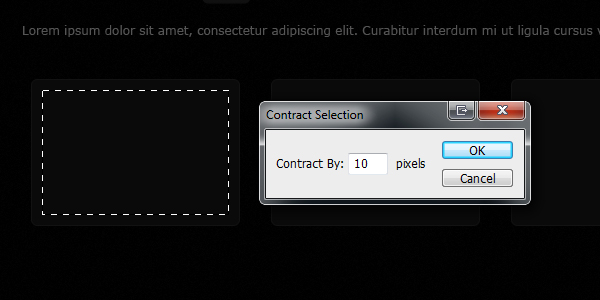
Once the selection has been contracted, go to Edit > Paste Into. Do this for all four rectangles until each rectangle has a product screenshot inside it.

Step 10: Creating the Footer
This is our final step. In the last little bit of space left on our canvas, create a rounded rectangle using the Rounded Rectangle Tool; the rectangle should sit below the Gallery.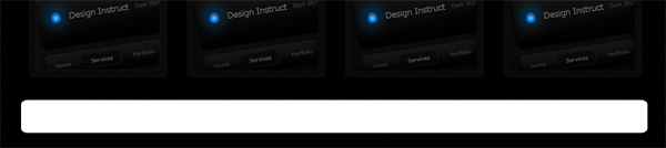
Give the rounded rectangle a Drop Shadow, Inner Shadow, Gradient Overlay, and Stroke.
Drop Shadow
Inner Shadow

Gradient Overlay
Stroke

This is the result of the layer effects we just applied to the footer:
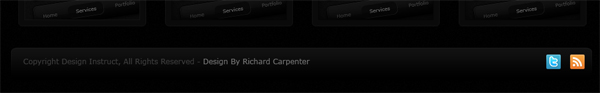
Using the Horizontal Type Tool (T), add your footer copyright information on the left.
On the right side of the footer, throw in your favorite social media icons and an RSS feed icon (alternatively, check out the Freebies section here on Design Instruct for some free social media icon sets).
Tutorial Summary
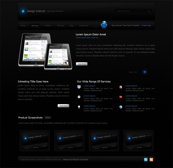
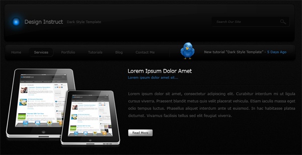
That’s it, all done! Your final layout should look something like the one shown below. In this tutorial, we created a simple web layout with modern-looking features such as slick buttons and some nice, glowing elements. Thanks for taking part in this tutorial. I’d love to hear your feedback and see your tutorial results (link to them in the comments and post them on our Flickr group).
Download Source Files
- extremely_simple_dark_webdesign (ZIP, 2.63 MB)


Can u buy herbal incence its a band nps its a legal high the uk have banned them but can u buy them on the dark web
BalasHapusRegards
Crazyask deepwebsiteslinks.com the DarkWeb Howmate